Due to their systematic nature, classic colour systems encourage the use of monochrome colour compositions. But the new StoColor System thinks outside the box, accommodating polychrome colour harmonies with the same ease.
Due to their systematic nature, classic colour systems encourage the use of monochrome colour compositions. But the new StoColor System thinks outside the box, accommodating polychrome colour harmonies with the same ease. The key lies in a fourth dimension – composition – that the StoColor System has added alongside the usual criteria of hue, saturation, and brightness. The system consists entirely of practical colour shades, is easy to use, and opens up possibilities between different hues.
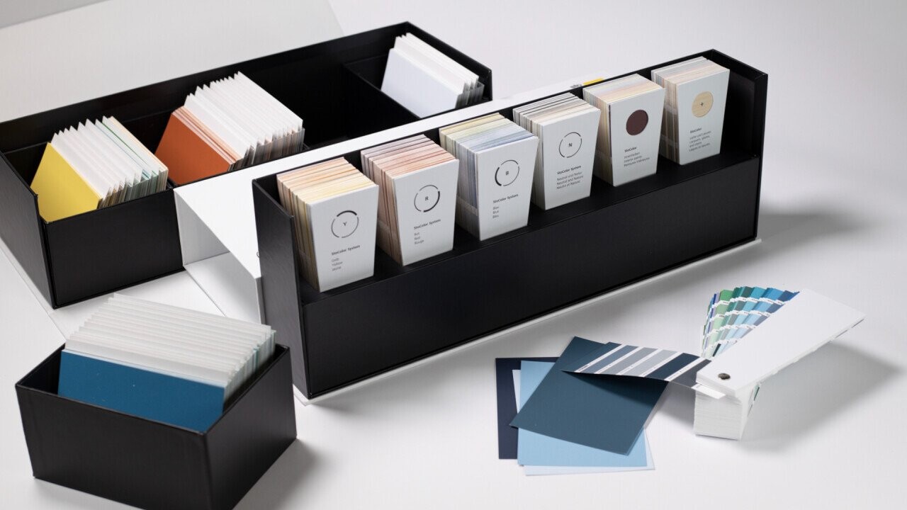
Colours are used for organisation, differentiation, orientation, and conveying messages. This is also the case – or even particularly the case – when it comes to architecture. In this context, the use of material colours on the one hand and of coatings (lacquers, glazes, renders/plasters, slurries, and paints) on the other needs to be carefully considered. Manufacturers’ colour systems are extremely helpful in this case, as the selection of colour shades is subject to technical and economic restrictions. Something that is possible with printing inks (CMYK), for example, cannot be transferred exactly into the world of building paints. For this reason, colour schemes need to be planned with the aid of specific tools.
These tools are colour systematics: they organise colour shades based on different models in accordance with the criteria of hue, saturation, and brightness. This is how the established StoColor System works too – but now, it has now been updated to include another dimension: composition. Peter Appenzeller, Head of StoDesign Germany, explains the thinking behind this decision: “We wanted to find a contemporary solution to the problem of searching for colour harmonies. Existing colour systems focus on monochrome composition. In many cases, a basic colour – red, yellow, or blue – is used in different shades: brightened, greyed, or darkened. But there are limits to what monochrome harmony can do. It creates a coherent appearance, but can sometimes seem boring. Our new StoColor System breaks free of this restriction: the intensity and brightness of a colour shade is presented in relation to other colour shades and other colour schemes.”
The system
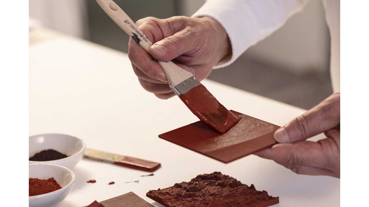
Within the individual colour areas, a range of different tonal values are defined. This selection is based on the properties of the pigments and dyestuffs, and how they can be implemented in practice. In this way, the StoColor System provides “recipes” for working with colour and compositions and finding the right colour harmony.
It is a coordinates-based, easily combinable colour system with a logical structure and is based on the three basic colours of yellow, red, and blue. Moving incrementally across the 360-degree colour wheel by five degrees each time results in 72 basic colour shades. In turn, these are available in a brightening matrix and certain greying matrices. The new colour system (sto.de/stocolorsystem) comprises 1,000 colour shades for the facade, 225 for interior design, as well as 200 lacquer colour shades and 38 wood stain colour shades.
For more information, visit: StoColor System – unendliche Möglichkeiten der Farbgestaltung